Farmatodo Powdered Blends
Health & Beauty, Packaging & Product Development
A modular and scalable packaging system for Farmatodo’s wellness line. Through structured design, typographic rigor, and a strategic color-blocking approach, we transformed technical complexity into an intuitive visual guide that stands out on the shelf and builds immediate trust.
Designing a wellness portfolio requires going beyond aesthetics; it demands the creation of a visual ecosystem. For Farmatodo’s supplement line, the main challenge was visual scalability: unifying over 10 products under a single identity while ensuring each reference stood out in a highly saturated category. We tackled this challenge through a modular design architecture.

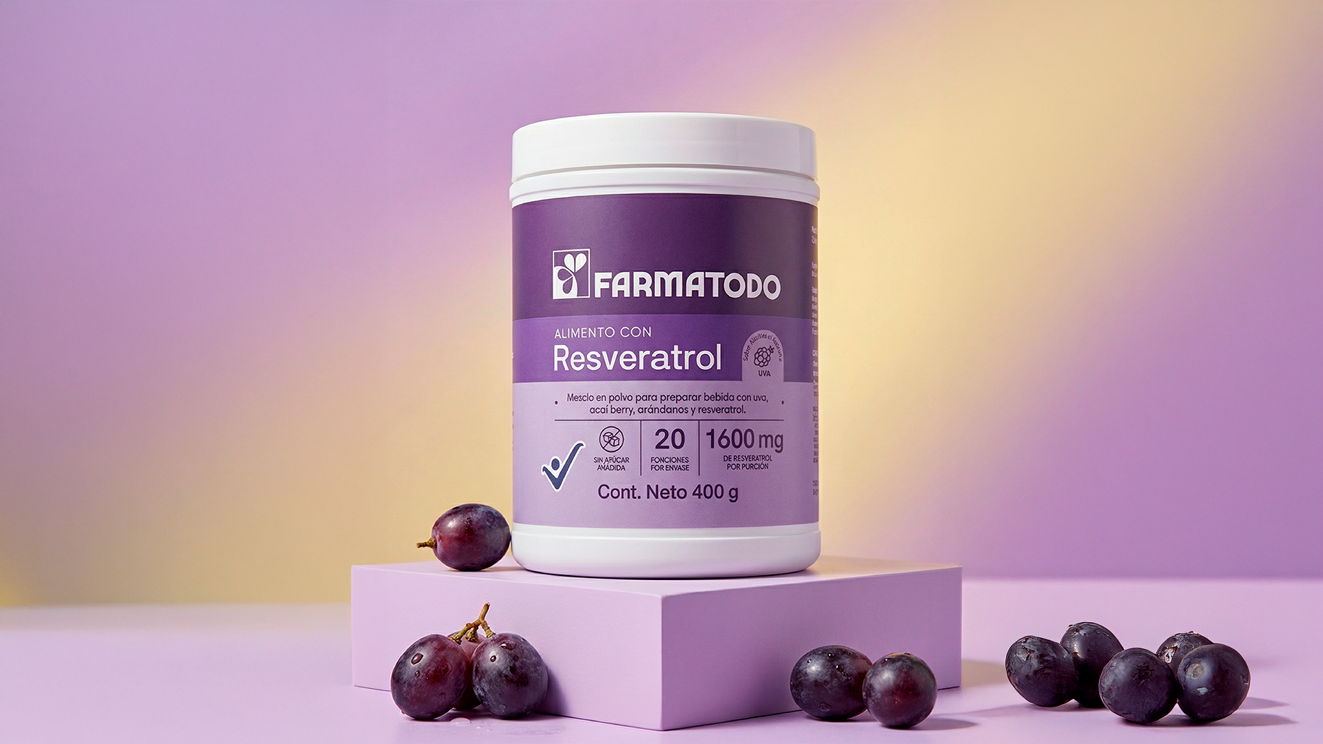
By utilizing a strict grid, deliberate use of white space, and geometric typography, we successfully projected the brand’s authority and clinical rigor. The composition directs the consumer’s eye straight to the doses, proving that successful packaging doesn’t need to create visual noise to stand out, but rather inform with absolute precision.
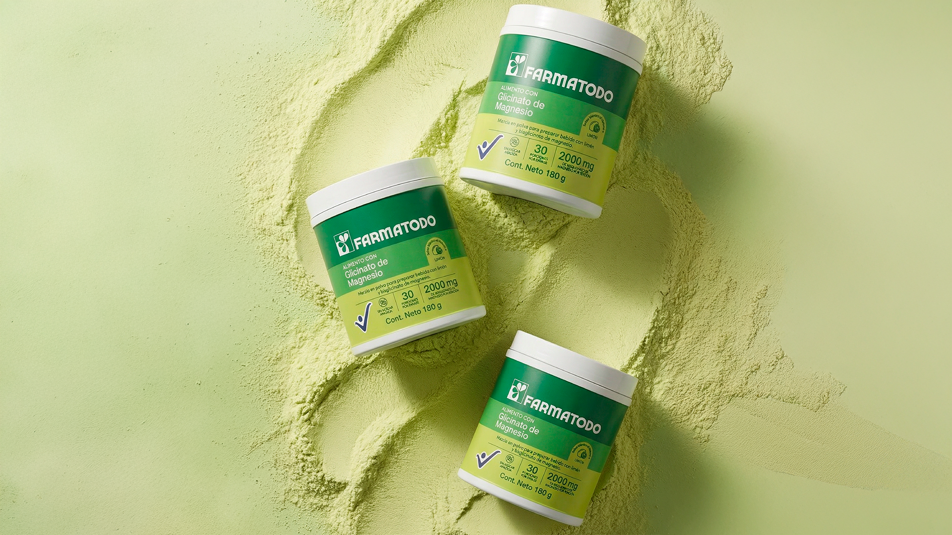
Understanding that in a retail environment color is the first seller, we implemented a strategic chromatic system to guide the purchasing decision. We structured a vibrant palette that color-codes the function of each product: warm tones for digestion, fuchsia for hydration, and deep colors for vitality.
The radical contrast between these saturated backgrounds and the white blocks of technical information is not merely an aesthetic choice, but applied usability. This decision reduces cognitive friction during the selection process, turning the packaging into an intuitive visual guide on the shelf. The final result is a pure systemic design that builds commercial presence, brand value, and absolute consumer trust.
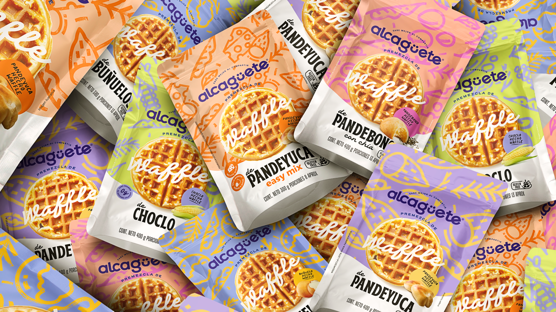
Alcagüete
Health & Beauty, Packaging & Product Development
Alcagüete is a Colombian food brand that reimagines traditional recipes into modern, healthy, and playful products.